Skip to content
  • Categories
  • Recent
  • Tags
  • Popular
  • World
  • Users
  • Groups
Skins
  • Light
  • Brite
  • Cerulean
  • Cosmo
  • Flatly
  • Journal
  • Litera
  • Lumen
  • Lux
  • Materia
  • Minty
  • Morph
  • Pulse
  • Sandstone
  • Simplex
  • Sketchy
  • Spacelab
  • United
  • Yeti
  • Zephyr
  • Dark
  • Cyborg
  • Darkly
  • Quartz
  • Slate
  • Solar
  • Superhero
  • Vapor

  • Default (No Skin)
  • No Skin
Collapse

AI Forum

K

Kling4AI

@Kling4AI
Unfollow Follow
About
Posts
3
Topics
3
Shares
0
Groups
0
Followers
0
Following
0

Posts

Recent Best Controversial

  • Qwen Image 2.1 Pro or 3.0? Comparing multi-image editing, transparent assets and typography
    K Kling4AI

    Qwen Image 2.1 Pro suits image creation organized around existing assets. It brings text-to-image generation, multi-image reference editing, transparent layer handling and local changes into one model, accepting up to ten reference images. For creators who need to retain a person's or product's features while combining visual assets, reference capacity and editing methods directly affect how a task is organized.

    Qwen Image 3.0 offers standard and Pro versions, covering everyday posters, websites and interface creation as well as more complex typography and fine detail. Which tasks suit each generation? The following comparison examines reference image counts, prompt controls, transparent assets and layout requirements to help creators choose for their current content.

    At a glance: the main differences between Qwen Image 2.1 Pro and 3.0

    Different creative platforms may expose different options.

    Comparison Qwen Image 2.1 Pro Qwen Image 3.0 / 3.0 Pro
    Main positioning Unified generation and editing, with multiple references, transparent assets and local changes Standard focuses on everyday creation; Pro focuses on complex layouts and fine detail
    Text-to-image generation and image editing Supported Supported by both versions
    Editing reference images 1–10 images 1–3 images
    Output dimensions Custom pixel dimensions supported Custom pixel dimensions supported
    Intelligent prompt rewriting Supported Supported
    Negative prompts This parameter is not offered by the current API Supported

    The most direct workflow difference is the reference image limit. If an edit needs four or more separate assets, moving to 3.0 requires reorganizing the inputs. If the priority is a dense information layout, 3.0 Pro is more worth testing.

    What does Qwen Image 3.0 bring?

    Standard and Pro versions offer different choices for different tasks

    The standard 3.0 version targets everyday posters, websites and interfaces, with more emphasis on the cost of ongoing production. 3.0 Pro concentrates on complex information organization, portraits and image detail.

    You can therefore assess composition and content direction with the standard version, then test deliverable proposals with Pro. This is a task-based trial sequence: after switching versions, the image still needs checking, and you cannot assume exactly the same composition.

    More explicit capabilities for dense layouts and multilingual text

    The 3.0 series supports inputs of up to 4.5k tokens and text rendering in 12 languages. Pro further targets complex layouts such as newspapers, storyboards, menus and exam papers. It is a useful first test for tasks that must organize images, headlines, small text and several content areas together.

    To judge whether these capabilities help the current project, examine text accuracy and layout relationships: are characters missing from headings, are captions beside the right images, and is the reading order clear? In text-heavy images, these affect delivery more than simply adding decorative detail.

    Negative prompts add exclusion conditions

    The current public API provides negative prompts for the 3.0 series, allowing you to specify elements or treatments to avoid. They work alongside positive descriptions but do not replace clear instructions about subjects, composition and changes.

    Prompt rewriting is shared by both generations. When an existing template needs strict control, compare results with rewriting turned off; when a short prompt needs more detail, assess whether enabling it helps. The presence of prompt expansion alone is not enough to decide whether to upgrade.

    Which Qwen Image 2.1 Pro capabilities remain worth keeping?

    Up to ten reference images for asset-heavy editing

    2.1 Pro accepts up to ten reference images. A person, product, background, composition and local details can come from different assets, making it suitable for workflows already built around multiple inputs.

    More references also need clear roles. Explain what each image supplies, which features must remain, and which areas may change, rather than simply uploading everything. For a single edit involving four or more assets, 2.1 Pro's input limit still has practical value.

    Transparent assets and local edits have independent value

    2.1 Pro supports ordinary images and RGBA transparent image generation, transparent layer editing and subject extraction. When generated assets must fit into an existing poster, page or background, transparent output becomes a concrete model selection requirement.

    It also supports circles, hand-drawn annotations or separate masks to specify local edit regions, with the aim of retaining a person's and product's features. Workflows already relying on these methods are worth keeping while you compare newer versions with the same assets. Before migrating, confirm that your platform exposes the corresponding input and output options.

    Which should you choose?

    The following table suggests first trials according to functional needs. Your own assets and delivery requirements should determine the final choice.

    Creative task First option to consider Reason
    An edit needs four or more reference images Qwen Image 2.1 Pro Up to ten inputs can preserve an existing multi-image workflow
    Generate transparent assets, edit transparent layers or extract subjects Qwen Image 2.1 Pro Native RGBA and subject extraction capabilities
    Continually create poster, website and interface drafts Qwen Image 3.0 standard Positioned toward everyday output and cost control
    Information-dense layouts such as menus and storyboards Qwen Image 3.0 Pro Positioned toward complex layouts and fine detail
    Edit with one to three references and add negative constraints Qwen Image 3.0 / 3.0 Pro The input count fits the limit, with a negative prompt option

    The generations can divide the work. Keeping 2.1 Pro for multi-image composition and transparent assets, while separately testing 3.0 standard and Pro for everyday and complex layouts, makes the benefit easier to judge than migrating every task at once.

    Explore Qwen image creation through WAN30

    Before choosing a model, start with WAN30's introduction to Qwen Image to explore text generation, reference image editing and common creative directions, then use this comparison to decide which tasks to test.

    For Qwen Image 2.1 Pro, the workflows worth retaining involve multiple references, transparent assets and local editing. For the 3.0 series, the division between everyday output and complex layouts is worth testing. Letting the task determine the model gives you a stronger basis than selecting by version number alone.
    Tools & Applications

  • Planning restrained Kling character shots: preserve the original emotion and check continuity
    K Kling4AI

    I manage Kling4AI. These are character-shot planning notes; the references are not generated test results.

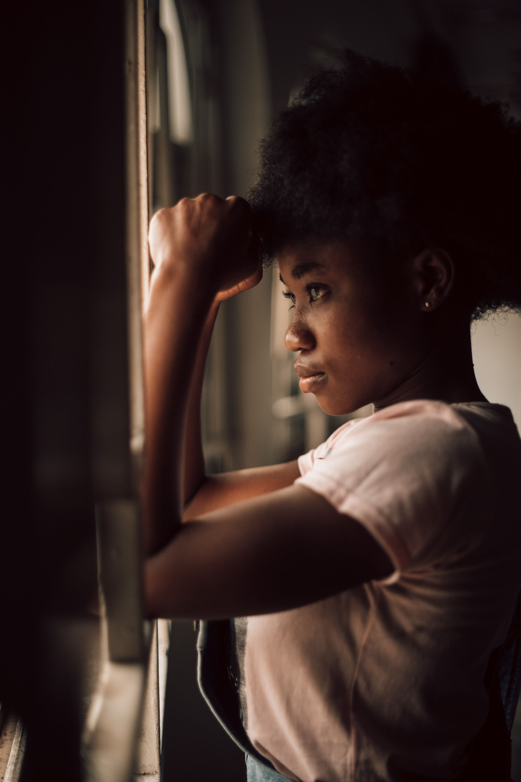
    What makes me hesitate over a character shot is often not sharpness. Skin, catchlights, and hair can be detailed, yet the person seems to be trying hard to prove to the camera that they have an emotion.

    To express sadness, looking up, frowning, and crying arrive together; determination becomes clenched teeth, a turn, and flying clothing. So many actions crowd out the interesting pause already present in the original illustration or photograph.

    When discussing character work with Kling 4.0, I care more about a simple question: can this image breathe a little without changing the emotion it already has?

    Original visual reference

    This article concerns my shot choices and writing habits. I care about leaving the character some room and judging a sample within a real narrative. Having more movement comes further down the list.

    The images and videos here are references for lighting, composition, and production settings, not Kling 4.0 generated samples.

    The character is already sitting by a window, standing at a doorway, or looking into the distance. These images have a clear state; the next task only requires a slight change.

    In contrast, taking a letter from a pocket, opening it, reading it, and crying involves several actions and prop interactions. I would not hand the entire scene to a single opening frame, because it would be difficult to decide where to stop.

    First ask what this shot needs to communicate. Is it a reaction to something heard, or someone undecided about leaving? Those tasks require different gaze directions and holds.

    I would check the available models, input requirements, and task fees through this online workspace, then try a short shot. Set references according to the current interface; a title mentioning 4.0 does not make another model's output a 4.0 result.

    When choosing a character photograph or illustration, first confirm permission for this use. Keep the reference and authorization together so that additional shots do not require asking again.

    Preserve the hairstyle, clothing, pose, and gaze before adding one action. Each round should not invent a more complicated character or intensify the emotional wording.

    Keep the character's profile, hairstyle, and collar from the reference. The seated pose remains unchanged, the gaze stays toward the window, and there is only slight natural breathing. Keep the soft window light stable; the camera approaches slowly a little, then holds at the end.

    This gives me a clear inspection list. Are the facial features consistent? Has the collar changed? Does the gaze suddenly jump toward the camera? Has breathing become exaggerated shoulder movement?

    A short prompt does not imply little thought. Once what stays and what changes are clear, one or two sentences can give a definite direction.

    The first keeps the camera position, adds slight breathing, and leaves the lighting largely unchanged. It fits beneath an internal monologue, keeping attention on the voice.

    The second still avoids complicated character movement while the camera slowly approaches from the side. The change in shot size adds pressure and suits a voice-over reaching an important turn.

    I also watch the sample under the actual dialogue. A blink may look natural in a loop but distract at the heaviest emotional pause. Suitability depends on the preceding and following shots.

    If the material is a visual reference rather than a record of an actor's performance, publish it according to its actual purpose. It can support discussion of emotion without constituting a verified character performance.

    An action's beginning attracts attention; the ending often exposes problems. Once the head has turned, do the features stabilize? Does the gaze settle somewhere definite? Does clothing keep moving inexplicably after the character stops?

    I give this tail extra attention. A stable ending leaves breathing room for the edit. If it suddenly deforms, consider whether an earlier cut is allowed instead of assuming the whole clip must be used.

    Lay out the next shot too. A profile followed by a medium shot must retain the same character's hair color, collar, and main-light direction. Individually attractive shots are insufficient for continuity.

    Fine hand movements, intense crying or laughter, and several people crossing closely deserve separate validation. A good static close-up does not establish reliable complex performance.

    The website offers several credit reward activities: credits for new registrations, check-ins, and inviting new users, plus additional credits when an invited friend completes their first top-up. These benefits help accumulate more creative credits. I would choose a small shot with a clear emotion first and try it using accumulated credits.

    For me, the most comfortable character shot makes viewers feel that someone is thinking without announcing that the person has started performing. Getting close to that is what earns it a place on my timeline.

    Original video reference

    Tools & Applications

  • Planning a Kling walking-video transition without passing synthetic cutaways off as location footage
    K Kling4AI

    I manage Kling4AI. These are planning notes; the original references below are not generated test results.

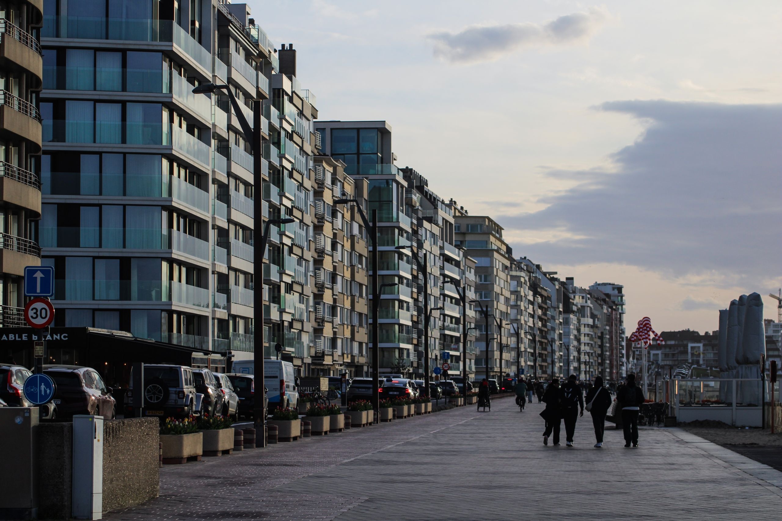
    When I film a walk alone, scenery is easiest to capture: street corners, cafés, the coast, and streetlights. What I most often miss is the breath between arriving at one place and moving to the next.

    Back in the edit, a morning street suddenly cuts to the sea at dusk. One sentence discusses being busy; the next shot is already quiet. The images look good, but viewers cannot see how the emotion traveled between them.

    When considering Kling 4.0, I start with these small pauses. I am giving an existing narrative visual room, rather than generating a trip that never happened.

    Original visual reference

    This article follows my editing sequence: find the break, choose suitable reference photographs, and then decide whether a moving cutaway is needed. I first resolve what I can in the edit.

    The images and videos here are references for lighting, composition, and movement. They are neither Kling 4.0 generated samples nor records validating model performance.

    Before saying, “I reached the coast and finally felt calm,” there should be some sense of a process. Footsteps, roadside shadows, or a pause may suffice; every street does not need to appear.

    I first arrange the actual shooting order and mark approximate locations and times. Separating shots that explain the route from shots that establish atmosphere prevents me from confusing their roles.

    Concrete details about the route, weather, and visit still come from accurate footage, maps, or text. An added atmospheric shot does not pass as a location record.

    A beautiful landscape alone may not connect easily to everyday narration. A curb, window frame, chair back, or backpack can make the view feel like something someone saw while standing there.

    These ordinary objects also help reveal spatial changes. A slight camera move makes the relationship between foreground and background easier to inspect than an entire frame of clouds.

    “Keep the curb, bicycle rack, and distant scenery in their positions. Move the camera slightly forward; leaves respond gently to a breeze and the light stays steady. Remain within the existing scene, without adding buildings or people.”

    This description states an intention, rather than guaranteeing accurate spatial reconstruction. I still check the bicycle rack, railings, and tree trunks in the output.

    Footage can cut a little faster while the narration describes busyness, then settle into a stable view when it describes stopping. Rhythm begins with editing, without adding a fast push to every generation task.

    I first rearrange the existing shots, try bringing sound in earlier, and try a brief pause. If the gap is already resolved, I do not generate more.

    “Preserve the shoreline and horizon from the photograph. Keep the camera fixed, with gentle continuous movement on the water and steady evening light. Foreground objects remain still. End with a quiet pause and no sudden zoom.”

    Afterward, I first inspect the shoreline for distortion and the waves for sudden direction changes, then decide whether the pause suits the narration. Attractive highlights cannot replace a spatial check.

    Solo footage often includes its own location sound: footsteps, distant traffic, or wind against clothing. It may be imperfect, but it carries clues about the real space.

    I listen for parts worth preserving. Sound can continue briefly across a cut between two images and soften the transition. When foley is needed, I match the action and distance.

    Sound cannot conceal an incorrect image. Strong wind over motionless trees, or crashing surf over calm water, makes atmosphere and picture conflict.

    The added view should resemble the original footage too. I follow its handheld grain, color temperature, and contrast, avoiding a sudden shift to unusually sharp studio imagery.

    When the video introduces a real location, I explain its synthetic or reconstructed portions clearly. I would rather viewers recognize a visual supplement than mistake it for a location record.

    After editing, I watch from the beginning and temporarily ignore which tools made which clips. I judge where to return to the speaker and where to allow more quiet by the whole video.

    However attractive a generated cutaway is, I keep it as an alternative if it disrupts the original rhythm of daily life. Time spent does not make inclusion mandatory.

    With a rough cut ready, I can try one small transition in the online workspace. Before submitting, I check the model, permissions, and current cost, then see whether a short sample connects before deciding to continue.

    What I want to add is the time viewers need to move from one thought to the next, rather than more scenery.

    Original video reference

    Tools & Applications
  • 1 / 1
  • Login

  • Don't have an account? Register

  • Login or register to search.
  • First post
    Last post
0
  • Categories
  • Recent
  • Tags
  • Popular
  • World
  • Users
  • Groups